Hello friends and welcome to Day 2 of the Simon Says Stamp Be Creative Blog Hop.
I'm so excited to be joining so many of my talented friends and designers on this hop and if you've arrived here from, Mindy's blog ~ then hello, but if not, and you want to catch up with everyone who is participating in this hop, then don't worry because you can head back to the beginning HERE.
There are so many fabulous new products in this release and I can guarantee that you’ll be spoilt for choice because every single one of them will have you heading to your craft room to BE CREATIVE. To see all the products in this amazing release, click---> HERE
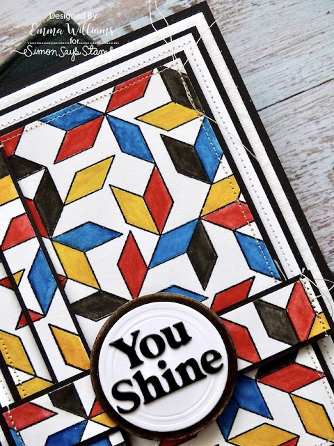
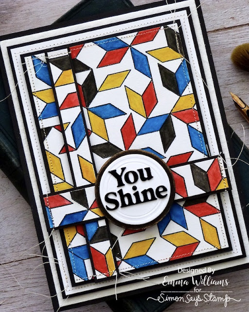
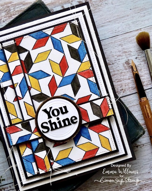
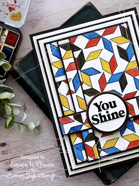
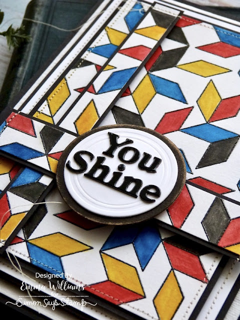
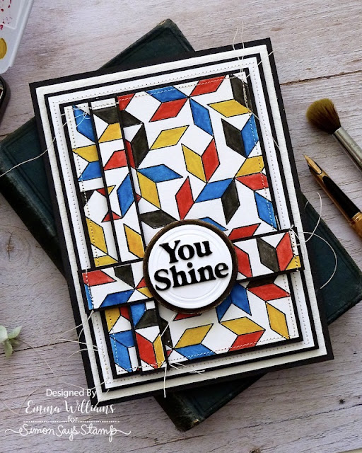
For my card, I was inspired by the colours and art of one of my favourite artists, Piet Mondrian, which was all about primary colours, and horizontal and vertical lines but I thought this colour palette would be perfect for using with the Parallelogram stamp, and I created a background that became the main focus of my make.
So let's get started on how I made my Mondrian inspired card...
CARD BLANK
To begin with I made my card blank from black card. This measures 13.5 x 18cm and is a tent style card with the fold at the top.
BACKGROUND AND LAYERS
Moving on to the background and for this cut a panel of Distress watercolour cardstock and placed the card, smooth side uppermost, inside my Tim Holtz Stamp Platform. If you don't have Tim's platform, there are other stamping platforms available and for larger stamps such as this one, I always find it will help to get a really good impression.
I inked the stamp with Simon's Intense Black Ink Pad and stamped the image directly onto the cardstock. If you haven't got a good impression, just repeat the process until you're satisfied. Remove the panel and sprinkle clear embossing powder over the ink. After tapping away the excess, heat emboss the powder until shiny and molten.
Now for the fun part, all that colour...
There is no right or wrong way to lay down the colour, you do you and just have fun but in keeping with Mondrian's work, I chose to use three primary colours, red, blue and yellow, alongside black and white.
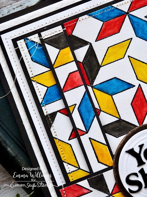
I watercolored my background using Tim Holtz Watercolour Pencils; Mustard Seed, Fossilized Amber, Salty Ocean, Prize Ribbon, Barn Door and Black Soot. I applied colour to each of the shapes using a water brush, and building up the intensity in layers.
Once I was happy, I allowed the background to dry before cutting a panel to measure 10 x 14.5cm. Don't throw anything away at this stage, you will be using those offcuts.
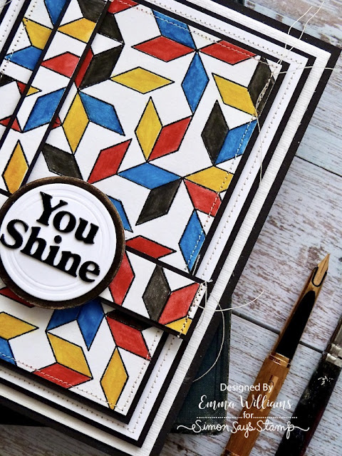
I machine stitched a border around the outside of my panel and then mounted it onto black cardstock.
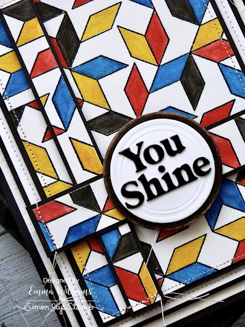
Taking the offcuts, I cut two further strips, 2 x 11.5cm and 1.5 x 14.5cm and also mounted these onto black cardstock, machine stitching the layers at either end of both strips.
Now to build up those layers. I wanted to create the look of a frame behind the main panel, so with this in mind, I began by adhering a panel of Dina Wakley's Watercolour card that I mounted onto the black card blank. I then cut a panel of white card, 11.5 x 16cm, machine stitched a border around the outside before again matting the card panel onto black cardstock. I attached the layered panel onto my card blank with foam pads before attaching the stamped panel, again using foam pads to add dimension and height.
Taking the two strips, I placed the narrower strip vertically down the left hand side and the wider strip, horizontally across the bottom section of the card.
SENTIMENT DIE CUT
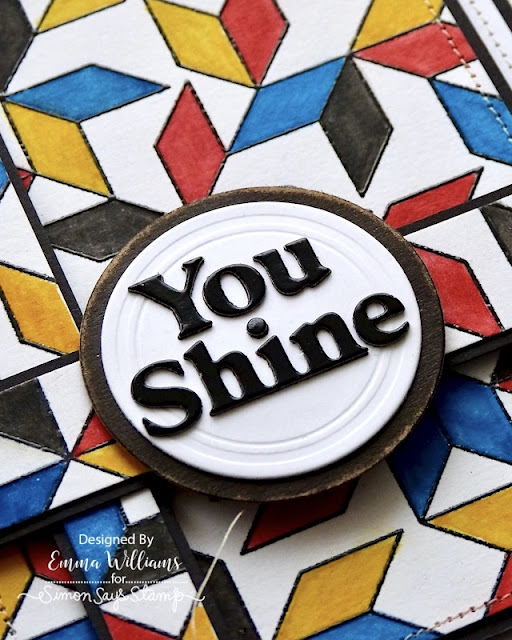
We're nearly there and all that's left is the sentiment. Using the You Shine Die Set, I cut two layers, one from black card and a second from gloss card. I haven't used the surround on this make. I layered the glossy sentiment over the top of the black card die cut and then adhered it to my circle that I cut using the Sizzix Vintage Labels Die Set by Tim Holtz.
I matted the label onto a circle of black kraft card, and then attached this to my design.
So that's my card finished and I hope you love what I've created and will be inspired by the ideas I've used.
Simon Says Stamp is giving away a $25 coupon to every stop on the blog hop! This means you can leave a comment here and on every stop along the way to increase your chances. Winners will be posted on the Simon Says Stamp blog on Wednesday, 22nd February and all winners will need to contact/email Simon Says Stamp to claim their prize.




Wowza!! Such a BOLD and cheerful card♥️
ReplyDeleteWhat a cool background! Great colors!
ReplyDeleteWow! What a stunning design! Love everything about this card!
ReplyDeleteI love that you colored in the shapes. I may not would have thought to do that. Awesome card!
ReplyDeleteWhoops, forgot to put my name.. I love that you colored in the shapes. I wouldn't have thought to do that. Awesome card!
ReplyDeleteThis reminds me of modern art. Very cool design and colors!
ReplyDeleteI love the new collection- especially Cathy Z’s designs!
ReplyDeleteVery bold and eye-catching designed card!
ReplyDeleteGreat card! Love this release!
ReplyDeleteYour colorful background reminds me of when I used to draw squiggly lines all over paper and color them in with different crayons. Fond memories!
ReplyDeleteOh wow! I love how your background turned out. That pattern really makes the sentiment stand out.
ReplyDeleteColor stencils and stitching.....oh my. Wonderful use of multiple techniques. Thanks for sharing your creativity.
ReplyDeleteVery pretty!
ReplyDeleteReally Beautiful!!!! I love the dimensional pieces you added!!!
ReplyDeleteI love geometric designs and this one is amazing. Love that fun, colorful card
ReplyDeleteLove all the color and these new geometric designs really speak to my days as a quilter. TFS
ReplyDeleteThis is fantastic!
ReplyDeleteThis card has a wow effect. Very cool design
ReplyDeleteYou win the award for coolest card! I love the circular sentiment against all the angles!
ReplyDeleteLove this design and the way you added the colors! So pretty!
ReplyDeleteSuch a bold and beautiful card!
ReplyDeleteThis is so creative and visually interesting.
ReplyDeleteSo creative. Love the sewing on it. [Bunny]
ReplyDeleteGreat masculine card.
ReplyDeleteWhat a great background! Pretty!
ReplyDeleteThis is such a fun, colorful card! I appreciate the coloring, the stitching, the layering, the composition!
ReplyDeletevery Mondrian like!!
ReplyDeleteLove these bold colours - wonderful card. TFS!
ReplyDeleteI love the bold graphics of this card. The stitching is just a fabulous touch. Love it!!
ReplyDeleteLove the modern look and the bold colors
ReplyDeleteThanks for sharing
wow - this card is amazing - love the layered design
ReplyDeleteWhat a fun card and so many occasions that it could be used for...
ReplyDeleteAwesome card. This would be such a fun background to color.
ReplyDeleteGreat design for a background!
ReplyDeleteYou nailed this one for sure!!
ReplyDeleteWhat a colorful card. Thanks for sharing!
ReplyDeleteThis is so cool
ReplyDeleteLove the bold primary colors. Great idea to use the cut off strips in the way you did.
ReplyDeleteI like the art deco vibe and creative use of panels
ReplyDeleteGreat card, Emma! TFS!!
ReplyDeleteLori S in PA
Stunning & very cool. Love your card!
ReplyDeleteThis card has such awesome layering and texture on it. It is really interesting and beautiful. I love it.
ReplyDeleteI like the fun and colorful card design.
ReplyDeleteMarisela Delgado said: So beautiful! mariandmonsterd@yahoo.com
ReplyDeleteYour stitching and all your layers are gorgeous! Those colors are wonderful, too.
ReplyDeleteFantastic design & use of colors. Love the layering!
ReplyDeleteSuch an awesome card!
ReplyDeleteYour card is so cool! It has an art deco feel and I am loving it!
ReplyDeleteYour card is so cool!! It has an art deco feel and I am loving it!!
ReplyDeleteI love the layering!
ReplyDeleteAdded this to the inspiration file. What a great layout for a geometric card.
ReplyDeleteGreat color choice and dimension. love the added stitching detail.
ReplyDeleteGreat graphic look, thanks for inspiring me!
ReplyDeleteI love the bold graphics of this card!
ReplyDeleteA very cool card! Wonderful colors! Thank you for brightening my day.
ReplyDeleteVery cool card--I like how you made it similar to an artist's work and the bold black sentiment shows up wonderfully! I need to be bolder in my work--thanks for the inspiration!
ReplyDeleteWhat an eye catching card, Emma! The red, blue and yellow give it a modern vibe. Thanks for sharing.
ReplyDeleteGreat card! Love the colors. Thank you so much.
ReplyDeleteWhat a fun coloring project! Lovely card
ReplyDeleteGreat colors - looks like fun!
ReplyDeleteLove all of this! Especially actually stitching on your card. It's been a while since I've done this myself, but now you've reminded me of that technique!
ReplyDeleteLove the colors and layers. Very cheerful card.
ReplyDeleteI love seeing this stamp colored in. Your card is one of a kind, great job!
ReplyDeleteWow!! Harlequin comes to mind. Love the bold primary colours. Beautiful card
ReplyDeleteI am very impressed with the way you colored in the design and the final result.
ReplyDeleteLove this colorful bold card. Very nice!
ReplyDeletesuper cool! i love primary colors
ReplyDeleteBeautiful and inspirational card from this SSS release!!
ReplyDeleteWonderful and unique background!
ReplyDeleteVery effective with the primary color palette
ReplyDeleteWow what a cool design!
ReplyDeleteFantastic. You've gotten so much
ReplyDeletedepth to the design. thanks for sharing
Love the dimension of your card! The use of the primary colors is stunning.
ReplyDeleteGorgeous card. The background reminds me of the Indian rangoli designs.
ReplyDelete